At Moventi, we don’t just follow the trends: we predict them. And when it comes to workplace interiors, colour is the game-changer. Whether it’s boosting creativity, creating calm, or setting the tone for collaboration, the right palette can transform how a space feels and functions.
So, what hues are set to dominate 2025? We’ve scoured fashion runways, Pinterest boards, and the freshest reports from colour trend forecasters like Pantone and WGSN. We’ve paired that intel with our own research into workplace needs and behaviours. What we’ve uncovered? Five shades that balance creativity, professionalism, and a touch of audacity.
Let’s jump right in…

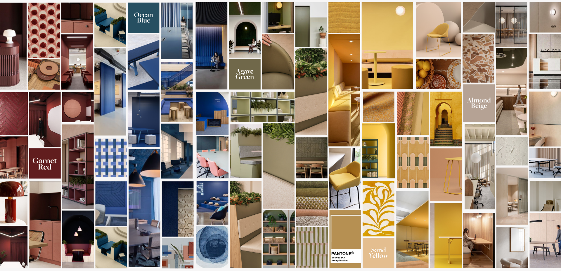
1. Dive Blue: Depth and Drama
2025’s blues are all about creating balance.
Picture the ocean depths – rich, dramatic, and endlessly calming. Dive Blue brings a touch of serenity to even the busiest office environments. It’s a shade that anchors open-plan spaces while giving meeting rooms and breakout areas a bold yet professional edge.
Why it works: Blue hues have long been tied to trust and focus, and Dive Blue takes that a step further with its intense, almost velvety richness. Oceanic blues work wonders for quiet zones or breakout areas, turning down the stress and inviting focus. Pair it with natural wood and soft lighting, and you’ve got a look that’s as grounding as it is inspiring.

2. Honey Mustard Yellow: Energize and Empower
This is yellow, but grown up. Honey Mustard brings warmth, optimism, and energy without the intensity of brighter yellows. It’s the perfect accent colour for stimulating creativity and innovation in collaborative spaces. Think upholstered chairs, accent walls, or even bold statement rugs. Elle Decoration nailed it when they said, “We’re not asking for permission with colour anymore.” This yellow? It’s here to make a statement.
Why it works: Yellow is the colour of energy and happiness. It’s the perfect pop of positivity for brainstorming zones or collaborative spaces. By dialling it down to a richer, mustard tone, it becomes sophisticated enough for the workplace while still sparking joy.

3. Warm Wine Red: Warmth and Confidence
A shade that commands attention without overwhelming, Wine Red is bold, timeless, and perfect for adding a touch of luxe to workplace interiors. Use it sparingly in shared spaces to create an atmosphere of confidence and sophistication.
Why it works: Red, especially in deeper tones, stimulates decision-making and evokes a sense of power. Wine Red brings warmth without veering into overstimulation, making it perfect for client-facing spaces or private offices.

4. Olive Green: Grounded in Nature
Earthy and natural, Olive Green brings a breath of fresh air into any office. It’s all about creating calm and balance, perfect for spaces designed to support employee well-being. Add it to biophilic designs, and you’ve got a colour that connects the indoors with nature, making employees feel refreshed and energized.
Why it works: Green is synonymous with relaxation and renewal. Olive tones are understated, making them a versatile choice for walls, furniture, or even acoustic panels. Plus, they pair beautifully with neutrals and other earthy tones.

5. Neutral Clay: The New Classic
Forget beige…Neutral Clay is where 2025’s workplace minimalism is headed. This warm, greyish-taupe tone is the ultimate backdrop, pairing with natural textures: linen, wood, matte metals for a workplace that feels modern yet timeless. As WWD aptly said, earthy tones are “anchoring spaces”, and for workplaces, that’s a perfect fit.
Why it works: Neutral colours are the foundation of any great interior design, but Neutral Clay adds a sense of depth and warmth that sets it apart. It’s flexible, timeless, and effortlessly chic – perfect for workplaces that want to feel professional without being sterile.