Colour is one of the most instinctive tools in a designer’s kit. We respond to it emotionally, often before we understand why. It sets the tone of a space, builds atmosphere and shapes how we move, think and feel. But beyond choosing a beautiful palette, the way colour flows through an interior can make or break the experience.
Chromatic flow is about more than coordination. It’s about rhythm. It’s about guiding people through a space using hue, tone and contrast in a way that feels natural, seamless and intentional. When it’s done well, colour moves quietly in the background, creating balance and momentum without shouting for attention.
What Is Chromatic Flow?
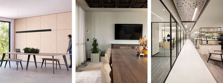
In simple terms, chromatic flow refers to how colours transition through a space. It’s the difference between a room that feels connected and one that feels chopped up. A space with good chromatic flow feels unified, but not uniform. There’s progression and variation, but everything belongs.
This might look like a shift from deep, grounding tones in focus areas to lighter, uplifting hues in social spaces. Or a palette that begins warm and gradually cools as you move through a building. The flow can be bold or subtle, tonal or contrasting, but it should always feel purposeful.
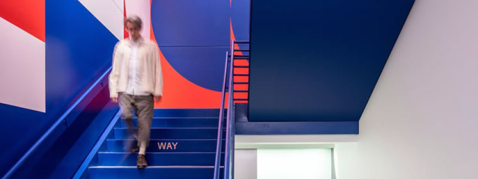
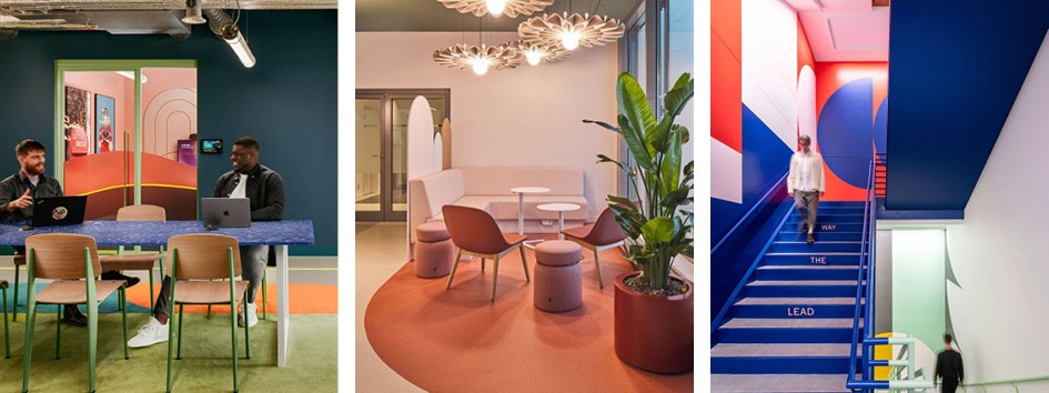
Colour as Wayfinding
Colour can quietly guide behaviour. It tells us where to go, where to pause and how to feel. Designers are increasingly using colour as a spatial language, rather than an afterthought.
In shared environments like offices, chromatic flow can help define zones without the need for walls or signs. A change in wall tone, a colour pop in the flooring, or a shift in upholstery can signal a transition. You’re entering a new mood, a new purpose, a new pace.
Tonal Layering and Texture
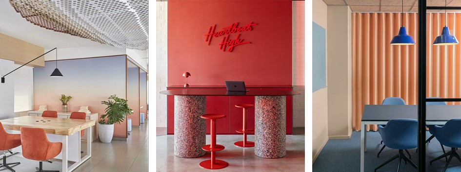
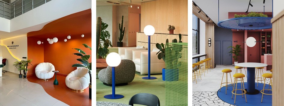
Creating chromatic flow isn’t just about picking the right paint. It works best when colour lives across different materials and surfaces. Think textiles, finishes, flooring, joinery, even lighting temperature. A deep green wall might be echoed in a moss-toned fabric, a metal detail, or a terrazzo fleck.
Layering tones in this way adds depth and richness without overwhelming the senses. It allows colour to travel through a space without ever feeling flat or forced.
Neutrals That Work Hard
A chromatic approach doesn’t mean every surface needs to be saturated. In fact, some of the most elegant colour flows start with a strong base of neutral tones. Think soft clays, chalky greys, muted olives or warm stones.
These act as the canvas. They give your accent colours room to move and breathe. They also help reduce visual fatigue, particularly in commercial environments where people spend long stretches of time.
A Tool for Emotion
Ultimately, chromatic flow is about how colour supports mood. It’s not just a visual device – it’s emotional. Whether it’s the balance of an uplifting pink corridor, the focus of a soft blue booth, or the social energy of a pale-yellow breakout zone, colour is a powerful tool for atmosphere.
We’ve put together a simple colour-mood wheel to help guide colour choices that support how people want to feel in a space.
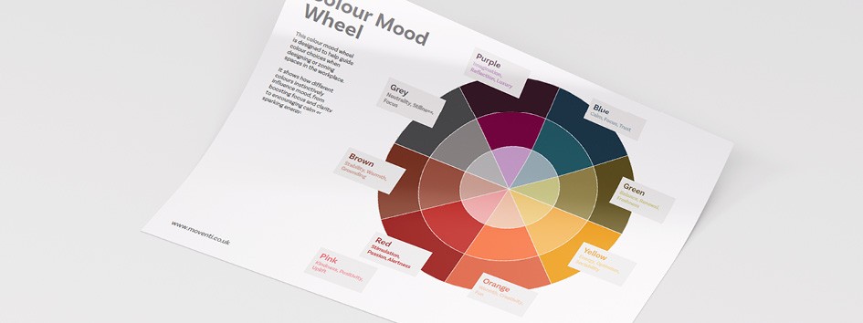
Download your copy here: https://www.dropbox.com/scl/fi/4wj0yukhgcwr88q308epc/Moventi_Colour-Mood-Wheel.pdf?rlkey=dygqqls56txoqum4ftmo9cynp&st=4mo889ga&dl=0
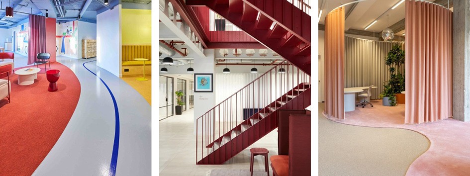
The Patchwork Effect
One common trap when designing with colour is creating spaces that feel like separate rooms stitched together. Each zone might look good on its own, but the transitions feel jarring.
The solution is to think ahead. Map how colours shift from one space to the next. Use bridging tones or materials that carry the palette across thresholds. Consider the sightlines. What colours will be seen together? How will they behave in different lighting?
When colour is treated as a continuous journey rather than a series of isolated choices, everything feels coherent and calmer.